Chrome Dev Tools Vertical Center Idea
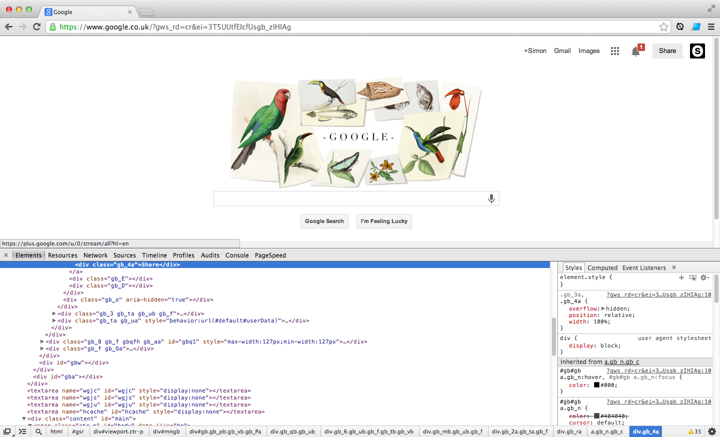
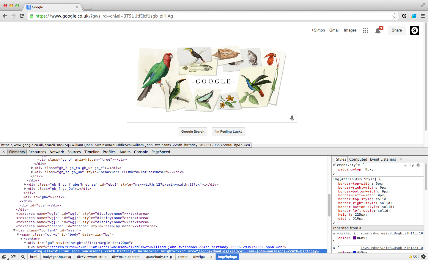
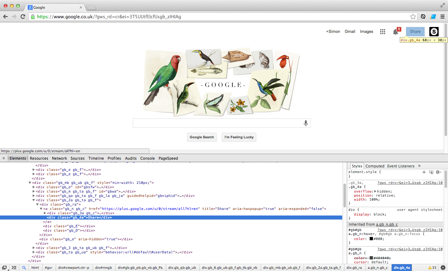
When using Chrome Dev Tools to inspect elements sometimes the element you're selecting appears at the top, sometimes the bottom and sometimes other places.
Like this:
Top:

Bottom:

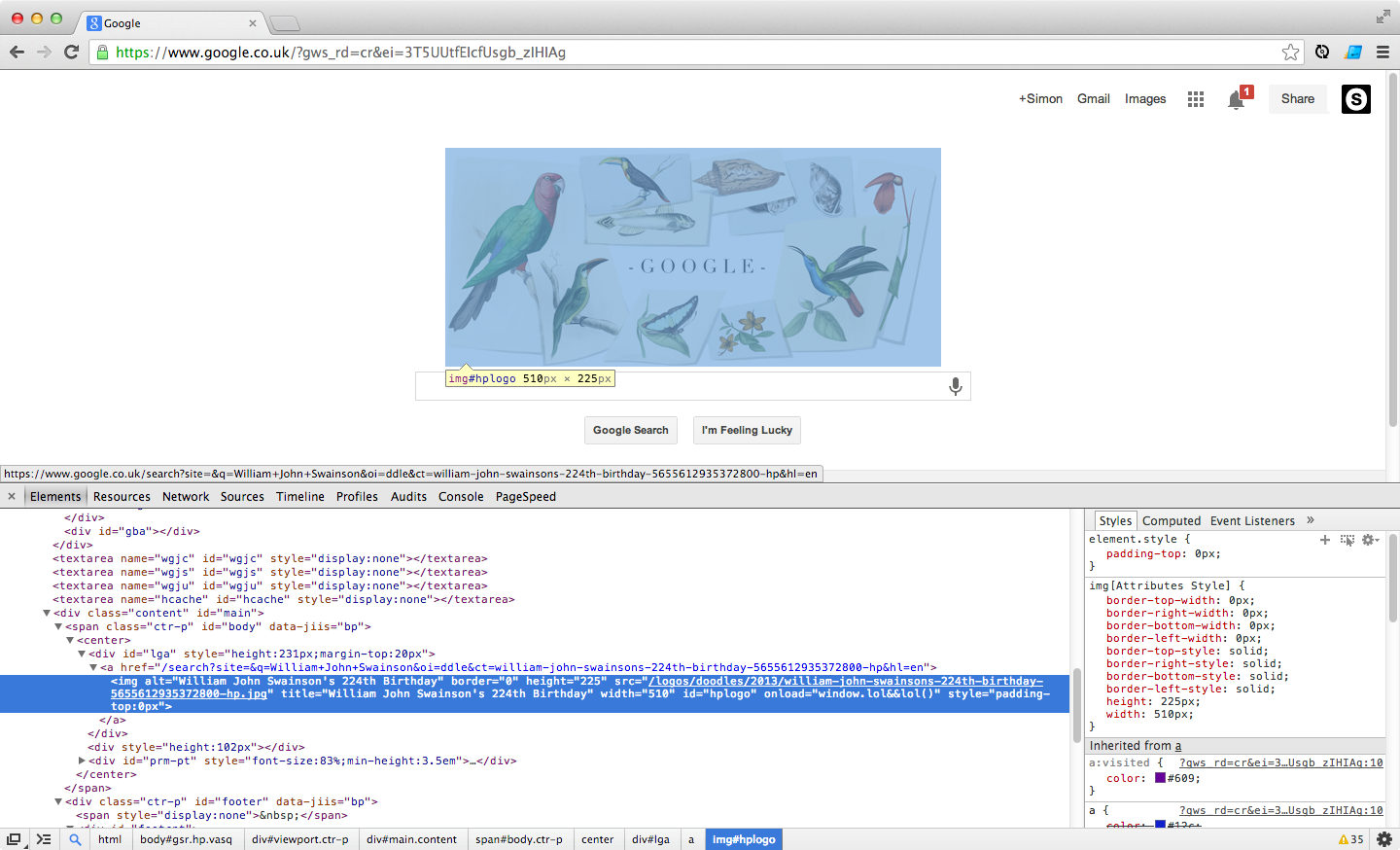
What if it always centred allowing you to see the surrounding elements, like so:
Center


Wowzaz…
A few days later and it's in Canary… Awesome! Cheers @ChromiumDev
Browse by category:
- apple1
- bash1
- browser1
- case study4
- chrome2
- chrome dev tools4
- clojure overtone2
- conference2
- css2
- dev tips1
- digihike1
- dotfiles2
- event4
- ffconf1
- freelance6
- gaming2
- health3
- hexo1
- https1
- jank1
- javascript1
- jobs1
- lego1
- mcrfred107
- nux1
- octopress4
- photography2
- raspberry pi1
- responsive web design1
- sass1
- screencast1
- speaking2
- svg4
- unplugged6
- upfrontconf1
- web development2
- webgl1
- wordpress17
- work51
- workflow16