Case Study State Supply
Case Study: State Supply
State Supply are known by building maintenance professionals across the nation as the premier boiler room supply superstore.
They stock a huge range of products for steam and hydronic heating systems and have been going since 1933!
Although having a fully functional e-commerce online platform, it was time for a revamp.
Process
It was a pleasure to work with John on this project. John is a JavaScript developer and had a clear idea of the work that was required.
Prior to the project we discussed the project and set out a plan. From then on we agreed to weekly sprints. Each start of the week, we'd have a quick catchup and I'd explain the work I was intending to complete. At the end of the week I'd explain how the week went and what I was planning for the next week.
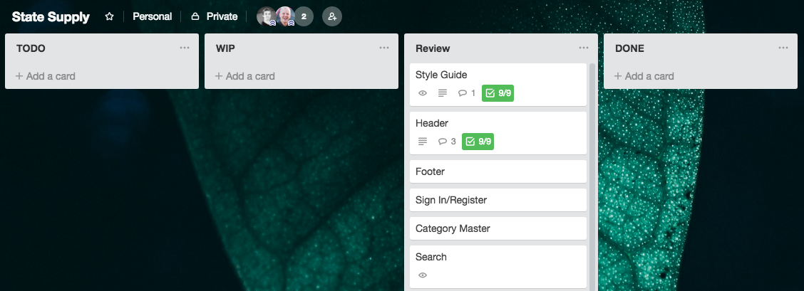
To further aid with the process we used a few online tools. Trello allows the creation of 'cards' and 'columns'. It's then possible to drag the cards around in the column and different columns. In the first week I created the project outline and attributed the work to cards. John was then able to order the cards into order of priority. When I had completed the work on a card, I moved the card along to another column ready for John to review.

As well as Trello we used Google Sheets. Here I'd document any potential issues I forswore and the intended progress for the week's sprint. Going along, and at the end of the sprint I would write up any issues I'd encountered and the actual progress made. From this information John was able to feedback on where to focus my time that would be of most benefit to him and the project. We could then discuss the issues and the solutions that I had presented.
Technologies and Key Responsibilities
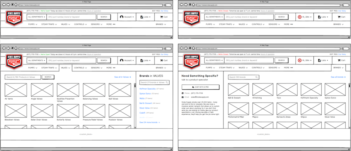
Using Balsamiq, John created wireframes. The wireframes were then given to a designer who then brought them into Sketch to design upon and export to Zeplin.
I love this workflow. In Zeplin it's great to be able to quickly view the project as a whole.
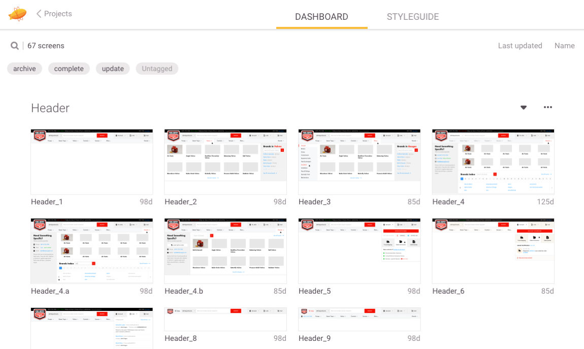
From having a clear overview of the project I was able to identify key components that could be built up to be re-used with modifiers in different scenarios.
If a design hadn't been finished or John thought up a new way of constructing a template it was easy for me to simply look at the new wireframe and craft it towards the design of elements we already had from the Style Guide. This meant less work for the designer and a quicker turn around on the development.
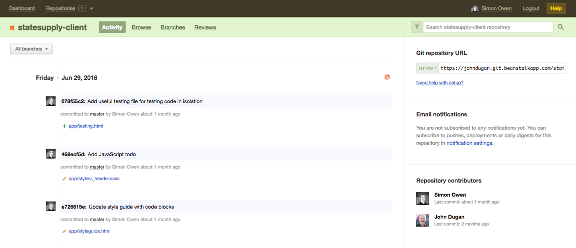
We used Git for version control to make sure that all work was backed up to the cloud as we progressed. I also pushed all my code regularly to Beanstalk, so John could view the progress whenever he wished to do so.
There's a number of frameworks and projects these days to help with Style Guides and Component Libraries. I wanted something that was super simple and lightweight. I opted to use yeoman a scaffolding tool for modern webapps.
By running yo in my Terminal, within minutes I had a development environment all ready to go. There's optional extras such as including jQuery and Bootstrap, but I opted not to use these, keeping to plain, good old JavaScript and Sass meant there's no overhead for the client if they're not familiar with the framework.
Yeoman also does the handy job of spinning up a local server and adding live reload, meaning that straight away I can go to localhost:9000 and view the site and then as I write code and save, the browser automatically refreshes to show my latest changes.
Style Guide and Component Library
First of all I built up the Style Guide, I'm a big fan of Brad Frost and his work around Atomic Design. It was a pleasure to have Brad Frost over for the inaugural UpFrontConf. Brad uses the analogy of LEGO. Within the Style Guide we create the LEGO bricks, taking this further I then built out the Component Library where I put together the Style Guide elements to make up the components.


Responsive Web Design
Whilst building up the Style Guide and Component Library I used a mobile first strategy and then added media queries as required to ensure each element worked across different viewport widths.
Browser Testing
At the end of each sprint I would allocate a day for browser testing. There's many different issues that occur on different devices and browsers. For example iOS adding extra styles that may not be wanted on inputs. Also, IE10 & 11 supports a different version of flexbox and thus requires further code and testing to compensate for this.
Templates
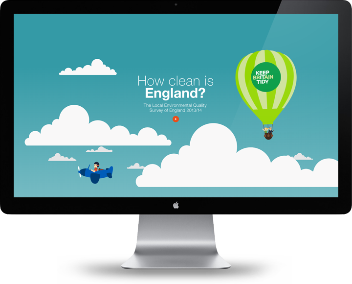
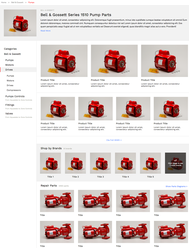
With the Style Guide and Component Library in place I then created the Templates. I took the components now created and used them to create Templates. There's many advantages of working this way, but one of the main ones is that it makes it much easier to re-use the components in a multitude of different ways. It ensures consistency across the finished website. It saves development effort being able to re-use rather than creating bespoke for each page and can help to improve the performance of the website, as you're re-using the same code.
Interaction and Animation
Some components such as the header had elements that could be hovered on, or clicked in order to show drop downs and further information.
In order to help style these and allow the client to quickly view them, I showed a default version, as well as an active state.
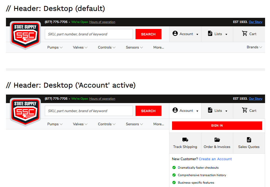
When interaction was required, I added useful helpers to the Style Guide to indicate there was an interaction and how to activate it.

Screencasts and Tutorials
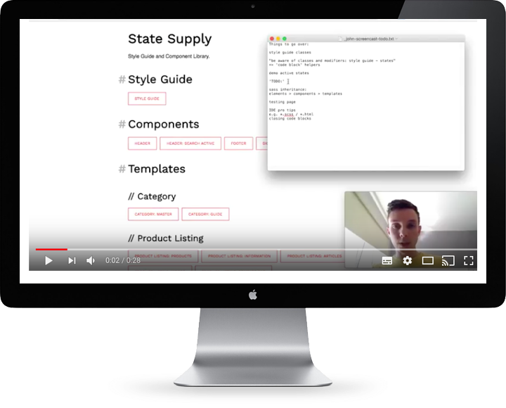
To further help John, I created a series of screencasts. The screencasts covered an overview of the work I had done, as well as how I structured the code and went about testing.
Closing
I'm super happy with the workflow I've got down here. If it looks good to you and you have a wireframe / design you'd like building for the web, please get in touch! I'd love to build it for you :)
Client Quote
Simon is fantastic to work with. As a developer myself, I was aware of Simon. When I found out he went freelance full-time, I jumped on the opportunity to work with him for an upcoming redesign of statesupply.com. Simon excels in understanding how high level business objectives translate in to code. Each discussion we had was deliberately focused on solving a specific problem. Being able to work in a client-provider relationship with someone who you feel is genuinely invested in the success of the project is rare. That is how I felt working with Simon. He cares. Beyond that, I was floored by his productivity. The amount of high-quality code that he produced in just four weeks is flat out impressive. It made me feel confident that our capital was well invested. As I continue to work with Simon in the future, I hope some of that productivity rubs off ;-)
John Dugan, Project Lead
Browse by category:
- apple1
- bash1
- browser1
- case study4
- chrome2
- chrome dev tools4
- clojure overtone2
- conference2
- css2
- dev tips1
- digihike1
- dotfiles2
- event4
- ffconf1
- freelance6
- gaming2
- health3
- hexo1
- https1
- jank1
- javascript1
- jobs1
- lego1
- mcrfred107
- nux1
- octopress4
- photography2
- raspberry pi1
- responsive web design1
- sass1
- screencast1
- speaking2
- svg4
- unplugged6
- upfrontconf1
- web development2
- webgl1
- wordpress17
- work51
- workflow16